Thursday, 31 May 2012

Thumbnails for buying online

More and more people are buying books either online or as ebooks, which means what people see when they're browsing are tiny thumbnails. So what makes a thumbnail cover, as opposed to a print cover, stand out?

Of the above, the ones that stand out are the ones where the design is:
  • bold with lots of contrast
  • uncluttered
  • where text is an important part of the design, it is large and in an easy-to-read typeface
The Steve Jobs biography stands out the most for me, even though the type is impossible to read at this small size. This doesn't matter though, because the title is displayed immediately below the cover image. The black and white also translates well onto e-readers that use only e-ink and don't display colour.

Wednesday, 30 May 2012

Display pages - Superfreakonomics


Here we have Superfreakonomics, by Steven D. Levitt and Stephen J. Dubner.

This cover is quite cluttered, but I think it works well because the title of the book is very clear, being at the top of the page in a large, easy-to-read bold typeface. Even though there's a strange break between 'Freak' and 'onomics' I think it works because it breaks up a large, made-up word into two smaller and more easily-digestible chunks.


Moving on to the table of contents:

I love the use of white space in this layout and the clear delineation of  each element. There are large margins on all sides, so nothing feels cluttered (despite the use of text boxes around the chapter numbers). It's very easy to find the chapter number, the chapter title, and the chapter description with only a brief scan and the hierarchy of headings is very clear.

This chapter headings use similar design elements, but less successfully.
As a reader, it's not clear which heading is more important, particularly as both headings are 'floating' in space with no clear relationship to each other or the main text.

Authors doing it for themselves: self-published ebooks

On a whim, I ran off to Amazon.com and picked a couple of self-professed self-published authors I found on the “Indie authors self-promote your kindle e-books herethread.

It interests me that even though ebooks have no physical form, the cover is still a vital piece of promotional material. However, it has to work at thumbnail size. If the cover and title interest you enough, you click on the icon to take you to the book’s page. This page includes traditional cover elements like a book description (the blurb), but also includes more information than a traditional cover (reviews, links to the author’s website, etc.).

Hot Tea by Sheila Horgan


This is a quirky cover design, but the typeface of the title is hard to read, especially at thumbnail size.  This is partially mitigated by the fact that Amazon.com lists the book title next to the image in easy-to-read type.There's also not enough contrast between the type and the background. There's also something amateur-ish about the cover photo. 

Maximum Discretion by Paul A. Fielding


The book title for this novel is nearly impossible to read. Since the title is the main feature of this cover, the fact that it's not readable is a major problem. It also interests me that the author’s name is being presented as the most important information on the cover, which seems unlikely as the lack of reviews for this book suggest that it is not a well-known author.

Updated 4 July
I also have to add this self-published cover in here because it illustrates the importance of not distorting images when re-purposing them to electronic format.


Tuesday, 29 May 2012

The Heir of Night

This book  by New Zealand fantasy author Helen Lowe recently won the Gemmell Morningstar Award for Best Fantasy Newcomer. I thought I'd include it, in the interest of supporting NZ fantasy.

The black and red combination makes for a striking cover despite the fact that this colour combination is relatively common at the moment. I think it stands out because the current trend is for red/black presented in a romantic way, whereas this cover isn't romantic - it's bold. It also stands out amongst fantasy titles because it doesn't necessarily look like a fantasy novel - it could equally be a horror. The all-caps sans serif typeface is also not typical of the fantasy genre - it's a convention more usually found amongst contemporary fiction.

The black to red gradient on the typeface is a clever way to get around the change in background colour.

I particularly like that the cover figure instantly tells you that there is a strong female main character (and she isn't in a sexy or submissive pose - sadly something of a rarity for a female cover model). This same cover figure is used on the other version of the cover I've seen around.

The other version of the cover I've seen around is more evocative of the fantasy genre than the first one. The typeface chosen for the title is interesting, with unevenly-sized 'T's and 'H's. It gives it almost a hand-lettered feel. The letters are again placed quite cleverly, with light type against dark smoke. The hint of colour on the bottom of 'night' makes it seem like the words are 'in' the picture and are being affected by the flames.

Friday, 25 May 2012

Girls in pretty pretty dresses

So, another post on YA cover trends. This time, it's the girls in pretty dresses. There seem to be rather a lot of them out there:

I can see why it's a popular design; they're very striking and strongly designed to appeal to teenage girls for the following reasons:
  • the use of teenage models
  • the luxurious dresses invoking a romantic feel
  • the melodramatic atmosphere
  • the element of mystery when we have a girl wearing a ball dress in an unlikely location (often in the woods). It makes the viewer want to know why she's wearing that dress and where she's going, which makes it more likely they'll buy the book!
I also found a far more detailed breakdown on YA cover trends than I've done here: http://www.katehart.net/2012/05/uncovering-ya-covers-2011.html

Friday, 18 May 2012

Kermadec

This book, designed by Spencer Levine, caught my eye today.
The cover image of a photograph of the sea changing into painted brush strokes is simple but striking. The typeface is a strong, modern font, the only type on the cover. This typeface, with it's very square letters, has practical, scientific associations. Inside, the title page reflects the colours and simplicity of the cover:

The white crest of the waves on the cover is echoed in the pattern of triangles crossing through the title page. I'm pretty sure the triangles are based on the geography of the Kermadec Trench.

The inside spreads are set in what I initially thought was a three-column grid. Fortunately, the designer was there to correct me and tell me that it is in fact, a six-column grid. You can see this most easily by looking at the placement of the captions.

 I think the detail of the running head is really effective, keeping the design elements present from the cover and title page going throughout the book.

Thursday, 17 May 2012

A pretty gold book

I found this book I Wonder by Marian Bantjes:

front cover

back cover


The book is very luxurious, with a cloth hardbound cover, gilded edges, and gold and silver leaf throughout (probably imitation gold leaf rather than actual gold). The paper is coated and glossy. Design is clearly the focus of this book, rather than the text, and the book is a lovely object.

The text frame on each double page spread is small and proportionately narrower than the page. Reading is difficult because of the distraction of the beautiful designs and also because of frequent use of a heavy, script-like serif typeface. I'm not sure who this book's target market is - perhaps people interested in design? But the size of the book (similar to a large paperback) seems unsuited to this purpose - this kind of book would normally be in a larger 'coffee-table book' format.

Monday, 14 May 2012

Really hard to read titles

Found this book, The Grand Inquisitor:

That title is ridiculously hard to read, even close up. The cover just looks like one big scribble, especially from a distance.

Also this book, Extremely Loud & Incredibly Close:
This cover is incredibly creepy due to the unnatural appearance of the boy, but the boy's eyes draw you in nonetheless (unlike the scribble above). The spidery writing for the title is hard to read at first, but fits with the cover's creepy tone.

Updated 20 June to add the following title:
I think this cover uses hard-to-read text with reasonable success because even if you can't make out the letters at first, you still see the overall image of twisted vines and leaves. The strange, twisty letters are appropriate for a strange book.

Updated 27 June to add the following:
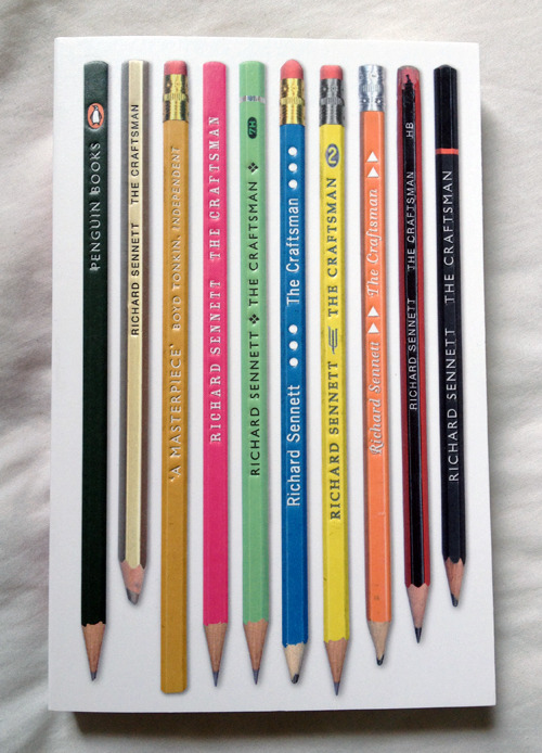
I think this is a successful cover because the title is hard to find. At first glance it just looks like an image of pencils, with none of the text traditionally found on book covers. It makes you go, huh? and pick it up. Then when you turn it on its side you realise that the writing on the pencils is the title and author.

Updated 28 June to add the following:
This book is notable because even though there are missing letters, the title isn't hard to read. This plays on the human ability to recognise words as long as the first and last are in place.

Updated 29 June to add two more successful examples of hard-to-read titles.

I really like this design because it ties so well to the content of the book:

  • The book's about censorship - and you can't even read the title.
  • The title is 'you can't read this book' and you can't read the title.
And a key point here - after you take a moment to join up the broken words you CAN read the title.   I think not abiding by this is what made my first example an unsuccessful cover design. The point of a hard-to-read title is to make the reader curious so that they pick up the book and take a closer look. But (and this is the important bit) they should be able to easily read the title when they look more closely.  The problem with the first example in this post is that it (a) is hard to read and (b) the fact that it is hard to read serves no greater purpose. After seeing all these other great examples of other ways to use hard-to-read titles in a cover design I dislike the top example even more.

I'm not sure whether the next example should be classed as successful or not.
In the right light, the silver foil of the title and author catches the light and stands out beautifully. However, at most angles the  title and author merge into the background design. But I think this is OK because the twinkliness of it makes it intriguing enough for a reader to pick up, even if they can't read the title at a distance.

Sunday, 13 May 2012

White covers

I've been seeing a few white covers with low contrast around lately, like the ones below:


Given the current trend towards dark covers for young adult books, this could be a smart way for books like the ones above to stand out on the shelf. However, this kind of cover only works if the vast majority of the other books are not white, so as soon as it becomes a trend it loses a lot of its stand-out value.

The fact that the title of Julianna Baggott's Pure is not easy to read at a distance might actually work in its favour, if people are compelled to look more closely. This title is also notable for being published with two different covers: low-contrast white and low-contrast black.

Saturday, 12 May 2012

A very pretty cover

The cover art is gorgeous. One relatively simple image evokes a lot of symbolism – falling, angels, blood. It also has very clear visual pointers from the light in the top right corner, down past the boy's wings to the title and then author.


It's hard to tell from the image, but the cover is also slightly pearlescent, adding an additional element of interest (and appealing to the teen market).


The typeface chosen for the title hush, hush fits perfectly with the slightly ominous atmosphere evoked by the cover art and the black and white palette. It’s a very decorative font with exaggerated serifs but it works when contrasted with the otherwise relatively unadorned layout.


The only thing I question is the colour chosen for the author's name - on the one hand it fits with the overall colour scheme, but on the other it's hard to read against the dark background.

Friday, 11 May 2012

Pop up book

I found this lovely pop up book for grown-ups at Unity Books:

Here's one of the paper bouquets inside:
The idea behind this book is that you open it to the desired pop-up bouquet, and hold it flat with the elastic bands (see the cover above) and you have an instant centre-piece for your table.  This is an excellent example of form following function.

Thursday, 10 May 2012

Mills & Boon books

There's a certain cringe factor to Mills & Boon books, but I've been thinking lately that they are perfectly designed for their purpose: light, throw-away romance reads for an audience who wants to know exactly what they're getting before they open the book.
Look how well labelled they are:


The label is often the most prominent text on the covers, way more important than the title or the author. Each label is also associated with a colour, to make it easier for readers to quickly locate the books they want on the shelf. The typefaces chosen for the labels also tie-in: in the medical example above, the typeface is a no-nonsense serif; the label for 'Desire' is in a romantic, decorative typeface.

The format and production values of Mills & Boon books also reflect their function. They are small, light-weight paperbacks, easy to hold with one hand, and easy to transport; they have low production values as they don't need to last much longer than a single read through. It's hard to see in the picture below, but the paper is very low grammage, thin and grainy, almost like newsprint in quality.

The layout of the text is very easy to read, with large font and margins:

Friday, 4 May 2012

Cookbooks part two – the insides

So last post I talked about cookbook covers; now to talk about the bits on the insides. I’ve split this post up into a few parts, which are:
  •  End papers
  • Table of Contents
  • Recipe layout
  • Indexes
Endpapers

From  Free Range in the City by Annabel Langbein
From Treats from Little and Friday by Kim Evans
Endpapers are a structurally important part of hardcovers, but they're also an opportunity to add something aesthetically appealing to the design.
The endpaper for Annabel Langbein's Free Range in the City adds an old-fashioned feel to the book.


The endpaper for Treats from Little and Friday is a fairly standard picture of food, but it adds a layer of luxury to the book, and also included is a bookmark, useful for a recipe book.


Tables of Contents
From  Free Range in the City by Annabel Langbein   
  • the large margins and white space between different subheadings make the layout feel simple, crisp, and easy to read.
  • The coloured subheadings with corresponding coloured page numbers act as navigation tools for the reader and make it easy to find the page number for particular sections.
The next table of contents is from Jaimie's 30 Minute Meals and covers a double page spread.
  
  • the typeface chosen for the meal titles is very 'light' and this combined with the all caps format makes it hard to read.
  • the different colours aren't sufficient to make the different sections distinct - it would work better if there were subheadings.
  • Some of the margins, particularly the left margins, are too small, making the text feel 'crushed' on the page. You can see that I'm having to flatten the left page down quite a lot in order to read the right page.
Recipe Layout
From  Free Range in the City by Annabel Langbein 
  • The information is placed in a logical order so that your eye goes from the title, to the description, to the list of ingredients and then to the instructions.
  • The different elements are kept distinct through the use of three different typefaces: a decorative typeface for the recipe title, a serif typeface for the description, and a sans serif for the recipe itself.
From  Gorgeous Cakes for the ultimate sweet sensation
This has a similar layout to Free Range in the City and is similarly easy to follow. The main difference is the alignment of the different elements. I think the mixture of alignments (particularly the right-alignment of the ingredients) sacrifices a small amount of readability in the name of increasing the attractiveness of the page.

From Jaimie's 30 Minute Meals by Jaimie Oliver
This layout feels too cluttered. Additionally, I'm not sure where I should start reading and what path I should follow - there are a number of subheadings but they've all been given equal weight. 

Indexes
From  Free Range in the City by Annabel Langbein
The  bold subheadings make things relatively easy to find and make the tabbed lists seem crisp rather than messy. However, you have to guess what category the recipe you want is filed under, rather than looking up the dish alphabetically.

From  Gorgeous Cakes for the ultimate sweet sensation
This seems like a fairly average cookbook index to me. One thing I do find is that the different alphabetical sections aren't separated by anything more than a space, which isn't terribly helpful to the reader given the amount of other white space on the page.
From Jaimie's 30 Minute Meals by Jaimie Oliver
This layout is reasonably successful, with recipes under different letters of the alphabet clearly separated by white space and a large letter. However, the typeface chosen for the big letters is a little too light - they don't stand out to me, which makes navigation more difficult than it should be.