That title is ridiculously hard to read, even close up. The cover just looks like one big scribble, especially from a distance.
Also this book, Extremely Loud & Incredibly Close:
This cover is incredibly creepy due to the unnatural appearance of the boy, but the boy's eyes draw you in nonetheless (unlike the scribble above). The spidery writing for the title is hard to read at first, but fits with the cover's creepy tone.
Updated 20 June to add the following title:
I think this cover uses hard-to-read text with reasonable success because even if you can't make out the letters at first, you still see the overall image of twisted vines and leaves. The strange, twisty letters are appropriate for a strange book.
Updated 27 June to add the following:
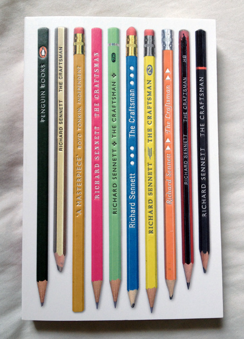
I think this is a successful cover because the title is hard to find. At first glance it just looks like an image of pencils, with none of the text traditionally found on book covers. It makes you go, huh? and pick it up. Then when you turn it on its side you realise that the writing on the pencils is the title and author.
Updated 28 June to add the following:
This book is notable because even though there are missing letters, the title isn't hard to read. This plays on the human ability to recognise words as long as the first and last are in place.
Updated 29 June to add two more successful examples of hard-to-read titles.
I really like this design because it ties so well to the content of the book:
- The book's about censorship - and you can't even read the title.
- The title is 'you can't read this book' and you can't read the title.
I'm not sure whether the next example should be classed as successful or not.
In the right light, the silver foil of the title and author catches the light and stands out beautifully. However, at most angles the title and author merge into the background design. But I think this is OK because the twinkliness of it makes it intriguing enough for a reader to pick up, even if they can't read the title at a distance.


No comments:
Post a Comment