Look at this lovely book,
Bitterblue by Kristin Cashore:
The title is in gold ink (imitation) that really stands out against the blue background. The cover image is very dark, but this makes the white text easy to read.
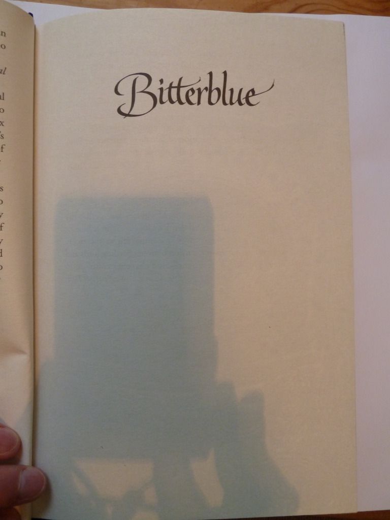
And as well as the extremely attractive cover, this book also has lovely design elements on the inside. First, the half-title page:
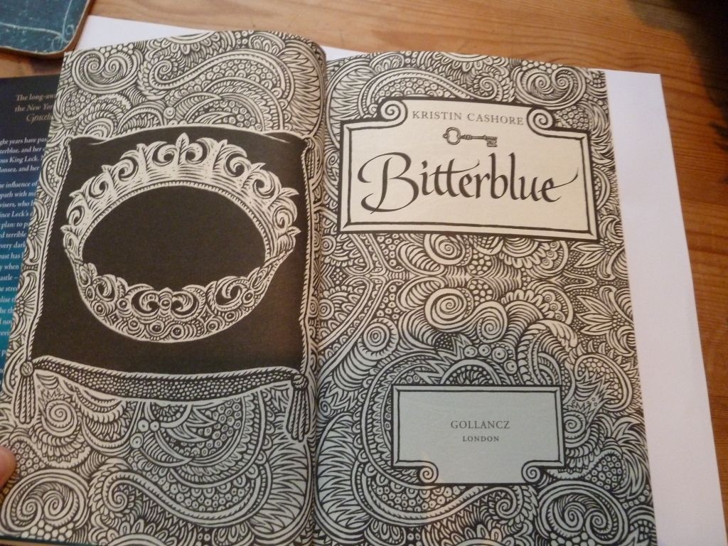
Simple yet effective, it repeats the typeface used on the cover. Then we have the title page:
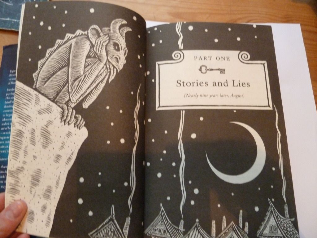
The title page is given extra emphasis by being given a double-page spread with lovely illustrations with a 'wood-cut' feel to them. This style of illustration is continued throughout the book.
Each part of the book has its own part-title page:
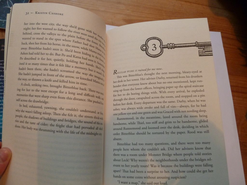
Then each chapter heading has a key motif. This refers to the fact that the book is about unlocking secrets (the US edition features keys as the central image on the cover).
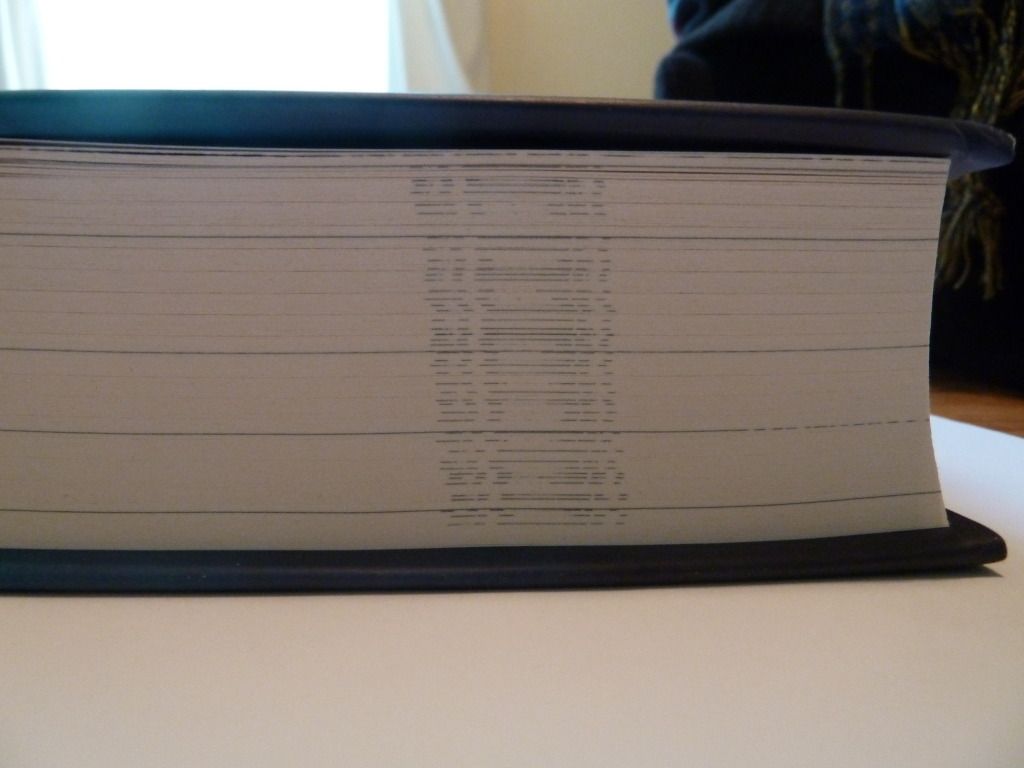
The end result of all this interior designy goodness is that when closed, there is a rather nice pattern formed:

No comments:
Post a Comment