There are multiple problems here, but the main issue is that the text is incredibly hard to read because of the background colour and texture. This problem is exacerbated by the choice of typeface. The typeface has uneven lettering, which makes it less readable than a more traditional sans serif. The typeface is quirky and is in keeping with the 'homemade' and 'organic' feel of this book, but is a bad choice to go on top of such a busy background. The other problem with this design is that the blurb is way too long and not broken up enough. Who's going to read such a long piece of uneven, hard-to-read text?
Monday, 11 June 2012
Design troubles - putting text on a non-plain background
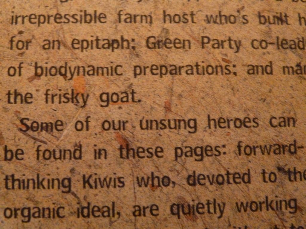
I found this example of unsuccessful blurb design on the back cover of The Wild Green Yonder by Philippa Jamieson.
There are multiple problems here, but the main issue is that the text is incredibly hard to read because of the background colour and texture. This problem is exacerbated by the choice of typeface. The typeface has uneven lettering, which makes it less readable than a more traditional sans serif. The typeface is quirky and is in keeping with the 'homemade' and 'organic' feel of this book, but is a bad choice to go on top of such a busy background. The other problem with this design is that the blurb is way too long and not broken up enough. Who's going to read such a long piece of uneven, hard-to-read text?
There are multiple problems here, but the main issue is that the text is incredibly hard to read because of the background colour and texture. This problem is exacerbated by the choice of typeface. The typeface has uneven lettering, which makes it less readable than a more traditional sans serif. The typeface is quirky and is in keeping with the 'homemade' and 'organic' feel of this book, but is a bad choice to go on top of such a busy background. The other problem with this design is that the blurb is way too long and not broken up enough. Who's going to read such a long piece of uneven, hard-to-read text?
Subscribe to:
Post Comments (Atom)


This is amazing book design thanks for sharing us best work.
ReplyDeleteLogo Design