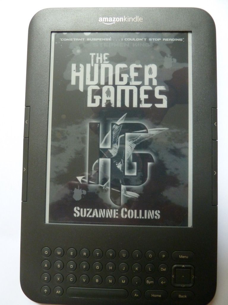
And here's the title page:

And here's the table of contents, where if you click on a chapter heading you'll be taken straight to that page:
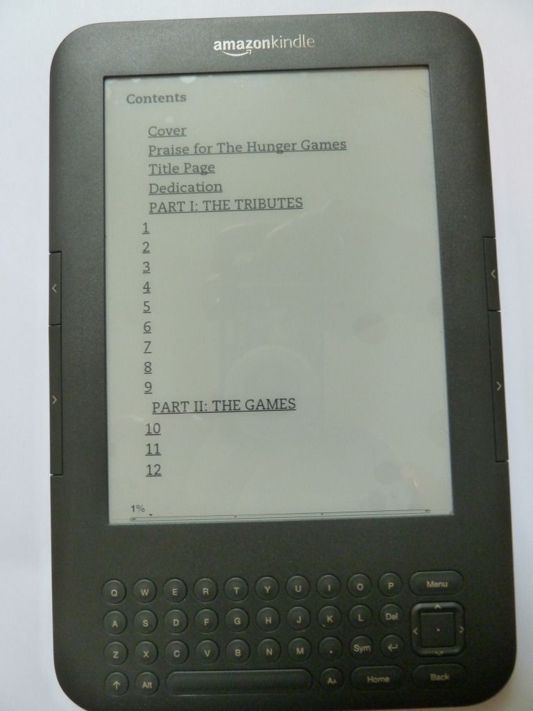
This table of contents is ugly, with no regard for pleasing layout. It's also somewhat difficult to navigate, as you can't see the whole table of contents on one 'page'.
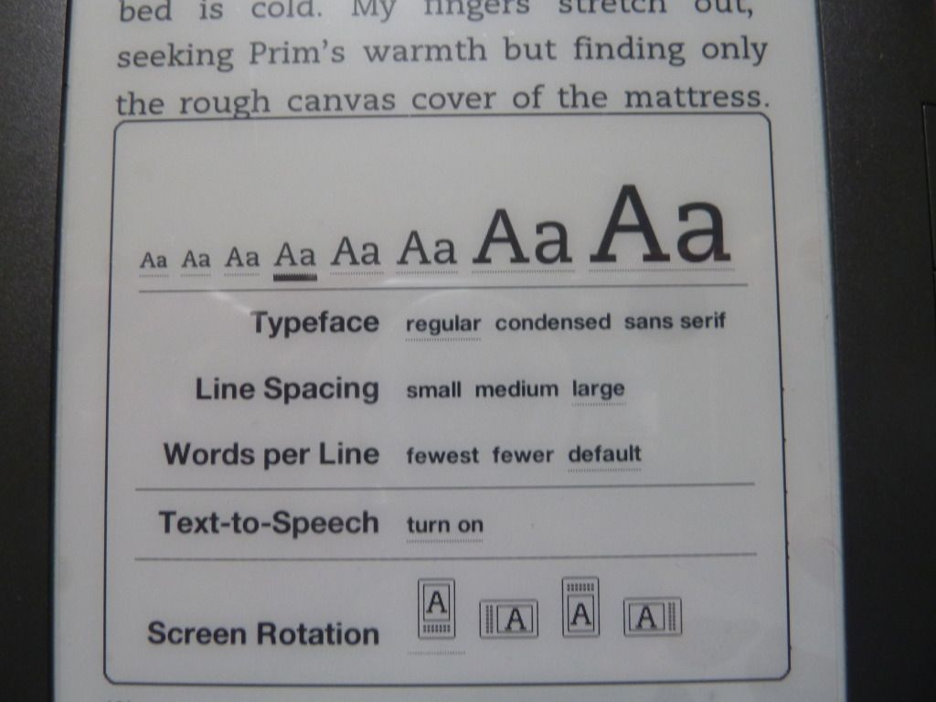
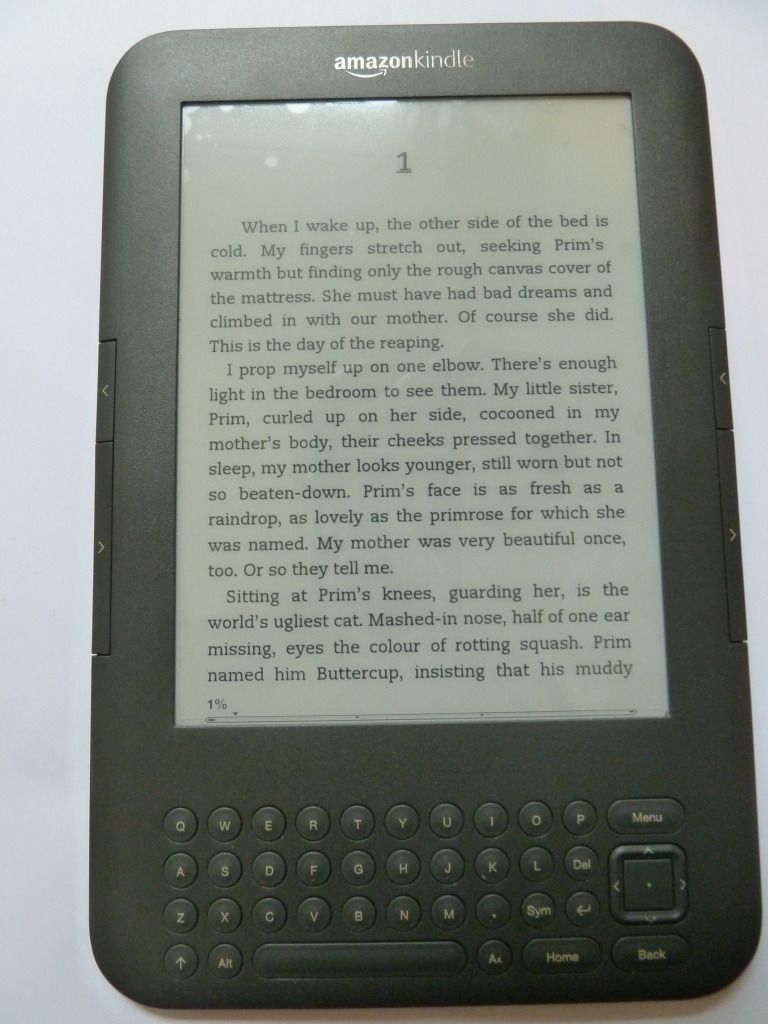
In terms of the page layout, this is pretty much up to the user. I can make the text bigger or smaller, change the typeface from regular to condensed or sans serif, change the line spacing, and even change the page orientation:
 |
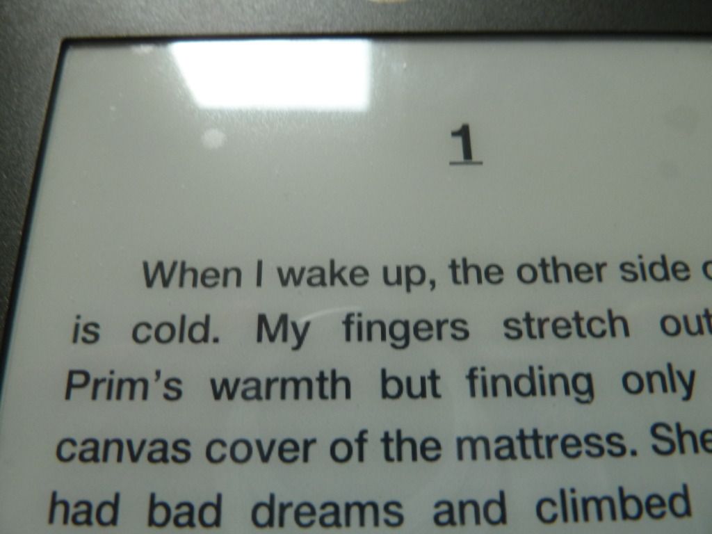
| smaller text |
 |
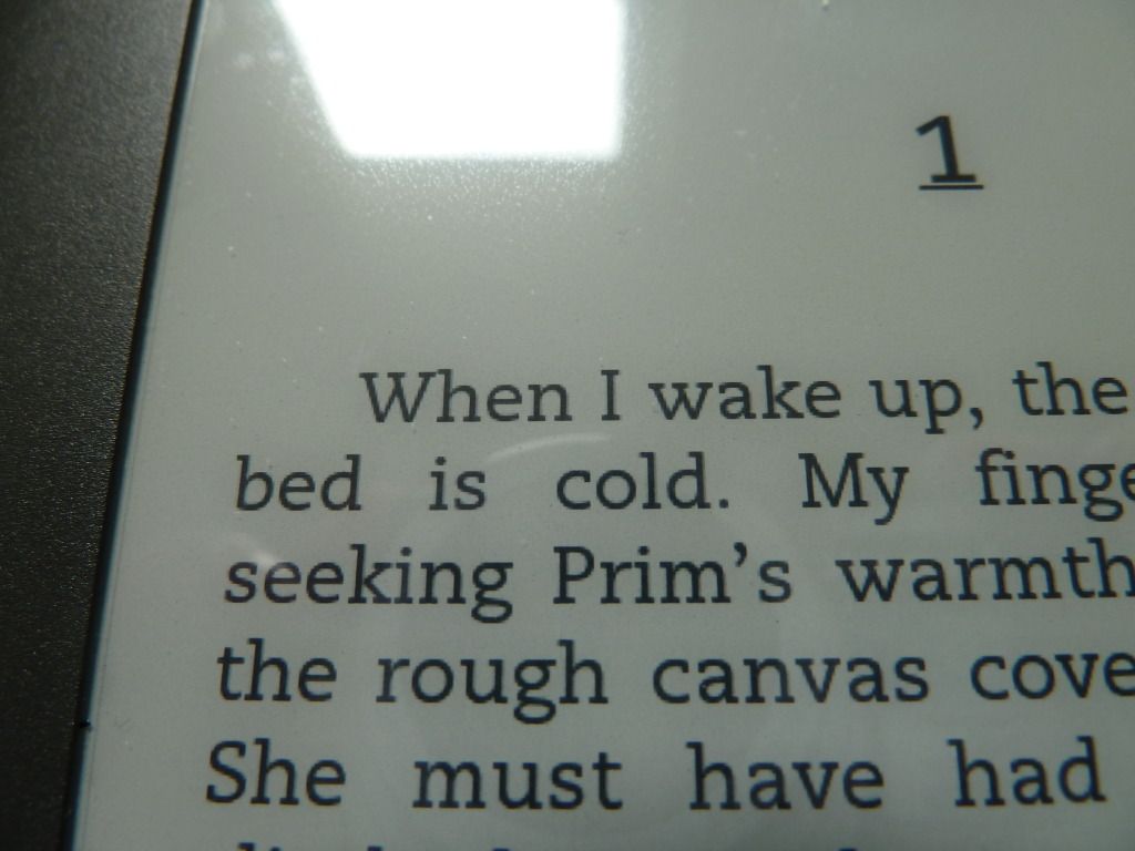
| larger text |
 |
| sans serif typeface |
 |
| regular typeface |
 |
| landscape orientation |
When the reader can change how the page looks at will, this defeats the purpose of designing a perfectly balanced page-spread. The downside is that the layout is not as nice as that of a print book. The upside is that it puts power in the reader's hands: they can read it in the format they find easiest. I think the ability to change the size of the text is probably the most useful, as many people suffer from eye problems that make reading smaller text difficult.
No comments:
Post a Comment